

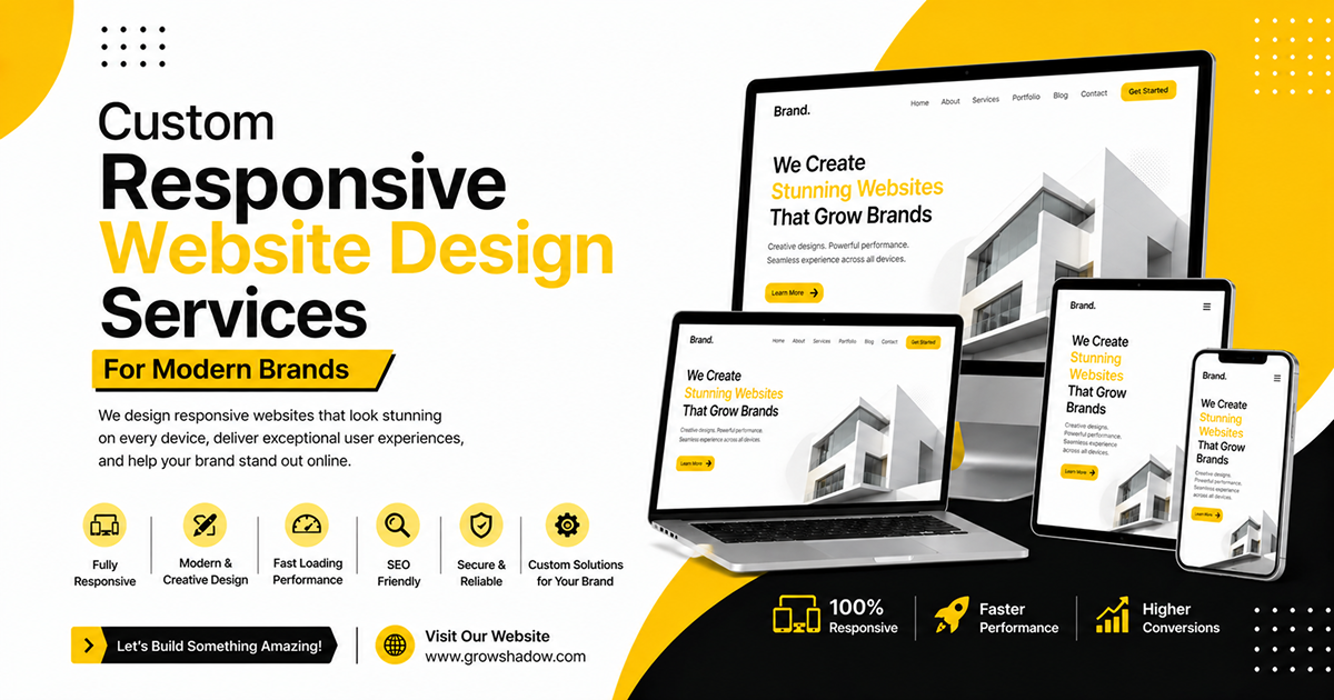
At Grow Shadow, we specialize in delivering advanced responsive website design solutions tailored for businesses that want to provide flawless digital experiences across desktops, tablets, and smartphones. Our responsive design experts create websites that automatically adapt to different screen sizes while maintaining visual quality, usability, and technical performance.
Whether you need a corporate website, service platform, landing page, portfolio site, or custom digital interface, our responsive design team crafts user-focused layouts that align with your branding, audience behavior, and business objectives.
We focus on building responsive website designs that combine modern aesthetics, mobile optimization, SEO-friendly structures, and high-speed performance to ensure your business delivers a consistent and engaging user experience across every digital touchpoint.
OUR RESPONSIVE WEBSITE DESIGN SOLUTIONS
Build fully responsive digital experiences optimized for every screen and device
Designs Delivered
Client Satisfaction
Design Experience
UI Experts

Website layouts optimized for flawless mobile browsing and smartphone usability.

Responsive structures built for perfect tablet viewing and interaction flow.

Large-screen optimized layouts for premium desktop browsing experiences.

Responsive websites compatible across all major browsers and platforms.

Search engine friendly responsive structures for better rankings and visibility.

User experience enhancements for smoother navigation and engagement.
We follow a strategic responsive design workflow to ensure every website delivers seamless performance, beautiful layouts, and optimized experiences across every modern device.

Business Discovery

Requirement Analysis

Audience Research

Wireframe Planning

UI Layout Design
%201.svg)
Responsive Structuring

Cross Device Testing

Quality Assurance

Performance Optimization

Final Deployment
.jpg)
Our responsive website design services ensure your website functions seamlessly across desktops, tablets, smartphones, and emerging screen sizes by adapting layout structures, content blocks, and interactive elements for every user environment and browsing platform.
.jpg)
We create responsive website experiences focused on improving navigation, readability, accessibility, and interaction flow so users can engage with your website smoothly regardless of the device they are using to browse your digital platform.
.jpg)
Every responsive website we design follows modern SEO and performance standards using optimized layouts, lightweight responsive frameworks, mobile-friendly structures, and speed enhancement strategies to boost search rankings and technical performance.
Frequently Asked Questions
Responsive website design ensures your website automatically adapts to different screen sizes and devices for optimal viewing and usability.
Yes, we design fully mobile-optimized websites that work seamlessly across all smartphones and devices.
Absolutely. Responsive design improves mobile usability, page experience, and search engine rankings.
Yes, we can redesign and modernize outdated websites into fully responsive layouts.
 Product Packaging Design